
Examining My Home Internet
Nearly a year ago, I wrote few posts describing data that quantify the human and infrastructural context of the Internet, and technical strategies for evaluating its performance (A, B). In January, the Center for Data and Computing (now the Data Science Institute), where I previously worked, received $1.2M in funding from data.org for measurements of Internet performance in Chicago neighborhoods. We have just shipped devices to 50 households across Chicago. Over the next few months, we will begin to accumulate a detailed view of variation in performance across the city.
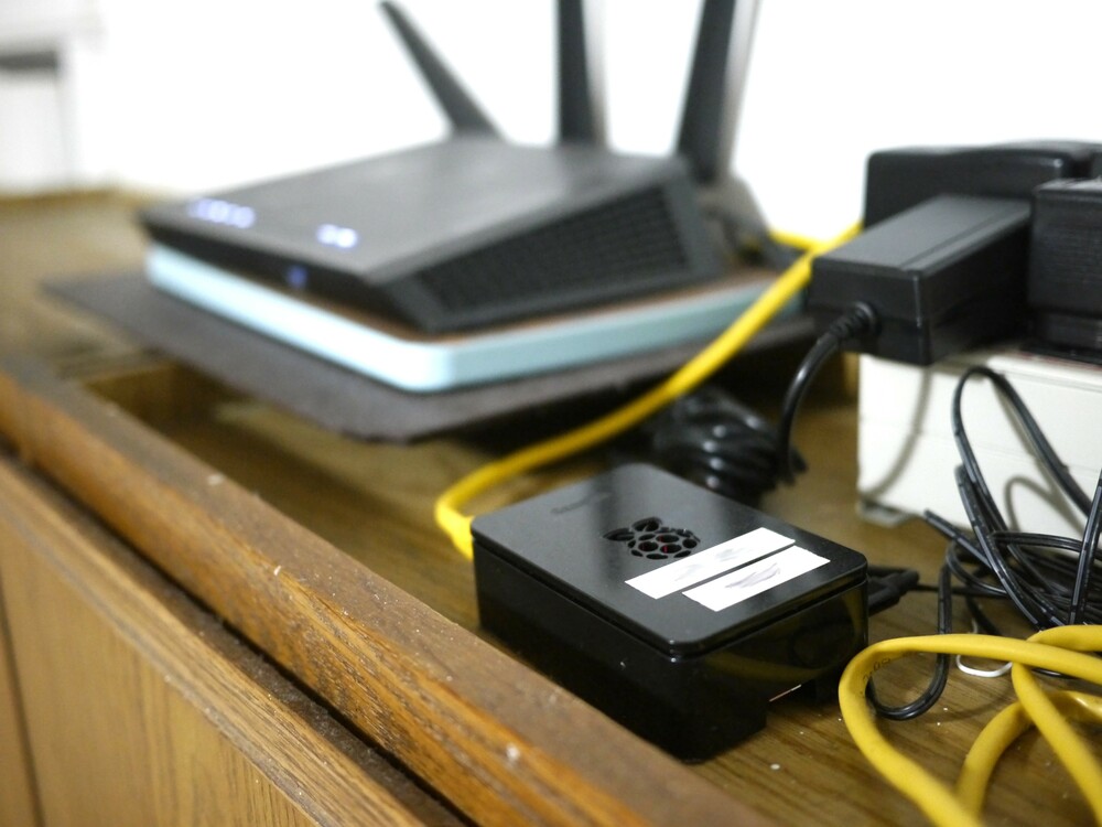
These measurement devices largely follow the strategies that I described in my post, Measuring Your Home Network. What has changed is that there are more tests, they are better validated, and the infrastructure grew up (thanks chiefly to Guilherme Martins). I’ve been beta-testing our setup in my own home for the last six months. It’s the little black box here, the raspberry pi:
In this post, I’ll showcase what we can understand or learn about Internet performance by examining a single home. In doing this, I’ll try to illustrate the practical meaning of our measurements. My hope is that describing my own network will help others understand what might affect theirs. In a sense, it’s like looking at a “FitBit” for my home network: it gives a sense of baseline health, anomalies, and my standing as compared with the population. The short term values are sort of “incidentally interesting” – they illustrate the structure of the Internet and my use of it. I can see diurnal cycles (sleep and and work), geographic and topological structure of the Internet, and the limitations of my home network. But I find the longer term picture quite engrossing, especially changes and anomalies. We can watch the Internet evolve, see how it fails, and diagnose failures.
As we extend to households across the city, it will be exciting to see how performance varies across the city.
Diving into the Measurements
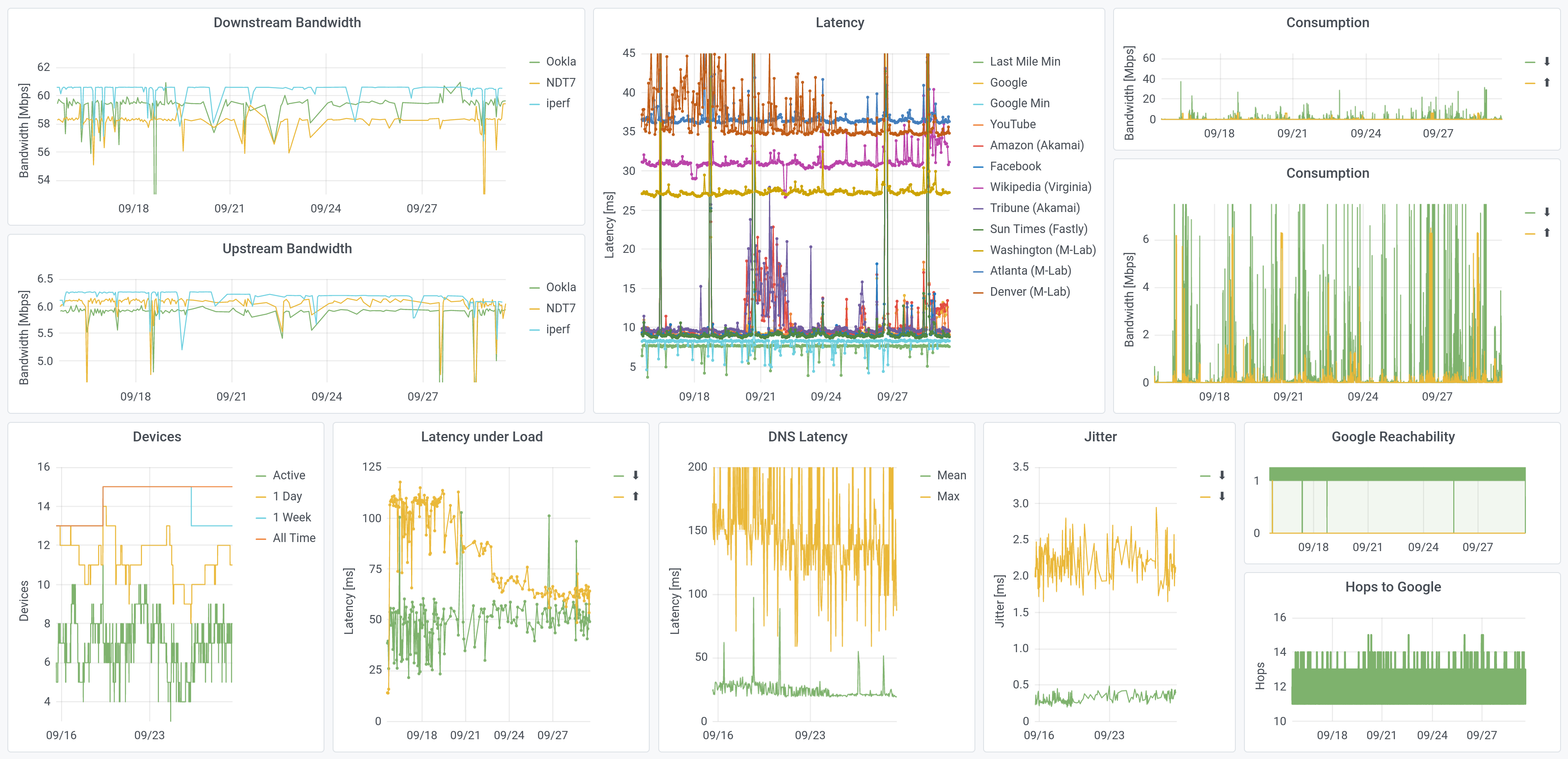
Welcome to my home: this is what my Internet has looked like, over the past two weeks. This is a lot of plots (!); this post will explain them and describe the interest I found in them, one at a time.
In order to measure how much Internet I use, I also redirect all of my traffic, to measure data consumption. We don’t do that for the “standard” boxes. Otherwise, the data here is what we see across the city, though this dashboard is more-expansive than the home tools we built.
The Need for Speed
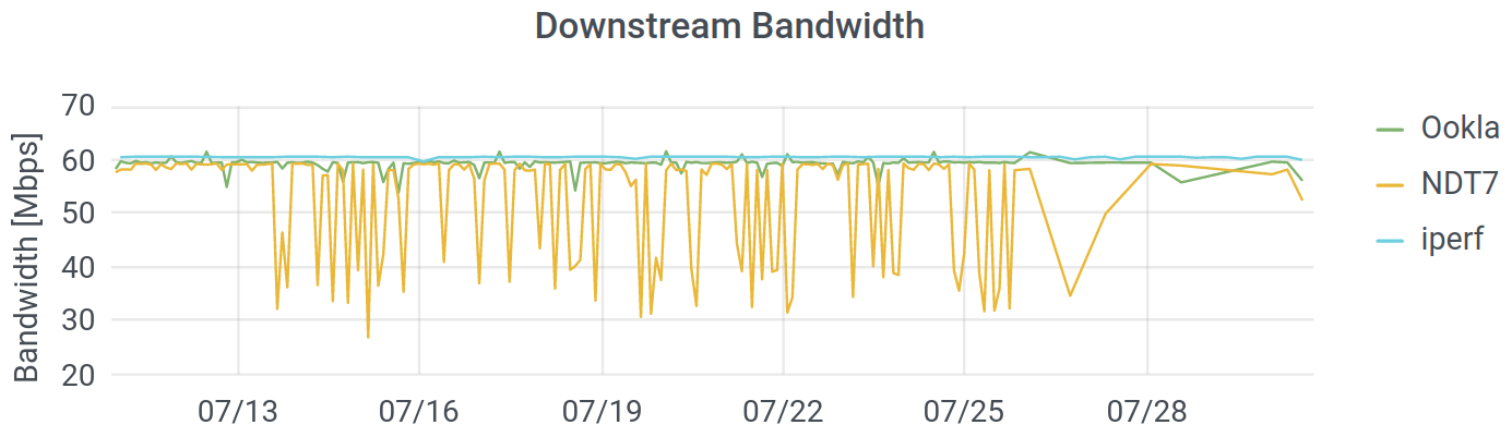
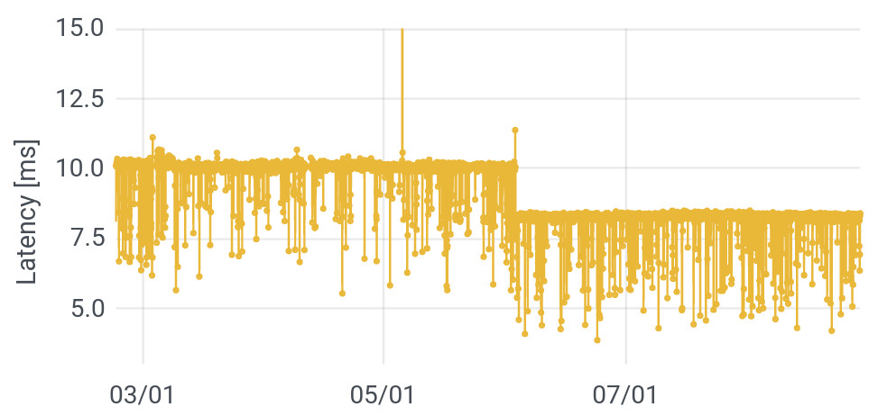
Bandwidth is how much data you can transfer per second. It is the thing that defines your “tier” of Internet service, and it is how the FCC defines broadband Internet (25 Megabits per second down, 3 up). Here is my downstream bandwidth, over the last six months:
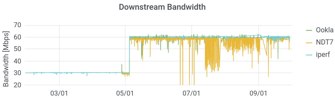
You can see that Comcast upped my ($25/month) contract from 30 Mbps in the downstream direction, to 60 Mbps, at the beginning of May. I suspect that they did this because they rolled out that higher speeds for their low-cost Internet Essentials program shortly earlier. I suspect that they did that (upped the “essentials” package to 50/5 Mbps), because people complained about low speeds, and speed is not usually actually the issue. I digress: you can see that my Internet got faster.
You can also see that we run three different tests. The Internet uses multiple protocols to transfer data, and we are testing the ones commonly used for normal files (images, text, etc.) as well as video conferencing and streaming. (We’ve deployed Ookla’s Speedtest, M-Lab’s NDT7, and a UDP test through iperf3.) While the overall picture is consistent, there is far more “noise” in the measurements from M-Lab – the measurements bounce around far more than they do for Ookla or iperf, especially in July. Since the protocol and the hardware were consistent and the other two measurements are stable, it seems that the M-Lab infrastructure in Chicago was not completely stable during that period. Some variation is natural, since I do use my network, but there are way more dips on NDT.
How Long Is It, To the Internet?
The next question is how long it takes for a message you send to some Internet server to receive a response. If you submit a search query to Google, you are sending many messages, receiving many responses and potentially asking the server to do some work, as well. You are receiving text, images, formatting, query results, and so forth. At the simplest level, we are interested in just the time that it takes to reach a server and for it to respond; this is called the latency, or round trip time (RTT). We measure lots of latencies, to different places on the Internet:
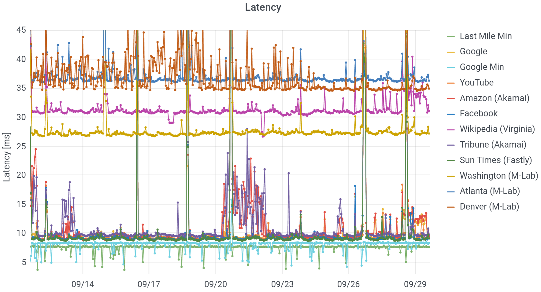
What do you see, in this picture? Working from the bottom to the top, we start with “Last Mile Minimum.” This is the fastest call and response, targetting the first router outside of my home network (technically: the first public IP address). On my cable connection to Comcast, this is about 7.8 milliseconds (ms), but that time can be even lower on fiber links. Next up, we see that the minimum response time for Google is around 8.3 ms, just half a millisecond longer. In other words, Google is probably physically very close to Comcast’s first router (near its headend).
Because I’ve had my setup installed for more than half a year, we can begin to see changes in the network. On June 3, pretty much all latencies dropped by two milliseconds. You can see that in the minimum time to Google, below. There were also a smaller drops at the beginning of February and at the end of April, more visible in averages than minima. This was clearly some sort of upgrade at Comcast. Coincident with these drops in latency, the number of “hops” or distinct, routable internet (IP) addresses between me and Google dropped, from 13-15, to 12-14, to 11-13. The topology of the Internet and the paths that messages take across it affect the performance.
From here on up, we’ll focus on average, rather than minimum times. The next group is a set of common services: local newspapers, Google (and YouTube), Facebook, and Amazon. These are all hosted on Content Distribution Networks (CDNs), physically near to my home – within a few milliseconds of the first Comcast server. Around September 21, there was a bit of a “storm,” with both Amazon and the Chicago Tribune, experiencing longer and unstable response times. Though Amazon has plenty of its own servers, its storefront is hosted alongside the Tribune, on the Akamai CDN. Since the other latencies didn’t change, this suggests a problem at Akamai.
After that, we have servers on the Measurement Lab network, in cities across the US. Since these signals have to travel farther to reach their destinations, they take longer to do so. Embedded in amongst this heap is Wikipedia, which does not use a CDN. All of its servers are in Virginia, and any request must trek to the East Coast and back.
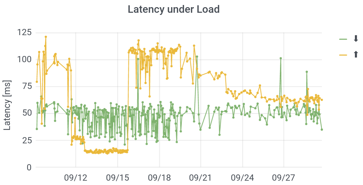
Finally, there are a number of moments in time (September 26, for example), when everyone’s averages get long. What the heck is going on? In short: I’m using my network. This is a phenomenon called buffer bloat or latency under load. The fact that I am downloading or uploading a file should not affect the round trip time to Wikipedia (if routers implement queuing correctly), but because my request can get stuck behind other requests on routers, it does. Engineers at Apple have argued that this is a better measure of actual performance, because if I’m using my own network, there’s probably other stuff going on too! They invert latency under load and call it “responsiveness.” Because I measure consumption continuously on my own network (we don’t and indeed can’t do this for other users), we can conclusively confirm that in my case, these spikes align with heavy use.
In order to measure latency under load / buffer bloat directly, Kyle MacMillan has implemented a test that he calls “operational latency” (oplat), in which he tests the latency while saturating a connection. As you can see, the latencies under upstream or downstream load – to a server at the University of Chicago – can be both way larger and far more variable than the latencies under unloaded conditions.
Outages
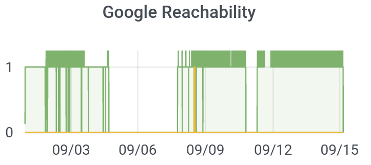
One big limitation of using “normal” speedtests or even latencies as a metric for the quality of an Internet connection is that the metrics don’t even exist when your connection is at its worst. You can’t run a Speedtest or test a latency when your connection is down! But since our devices are always on and test their connectivities to the Internet every five minutes, we can use them to measure how often (and where in the city) the Internet is completely out. I’ll call this “reachability.” Can we reach Google, for instance, or not?
I tested this feature a bunch, hence, many “dips” from 1 (on) to 0 (off) in the plot below. Further, I once unplugged the router instead of an appliance, accidentally shutting off our Internet for the night. But you can see that Comcast actually went out in my home for about three days (!), from September 4-7. They eventually sent a technician. We then learned that a dozen other units in my apartment block were also out due to loose wires, even though they Comcast initially declared that “there are no outages in your area.”
We want to know who in the city is subject to outages, and how long those outages persist.
Should I Upgrade My Internet Contract or My Wi-Fi?
To my mind, one of the most exciting features that we have built is an home-network speedtest. This was architecture I prototyped; it was then brought to production by Jesse London. If you go to speedtest.net or M-Lab and try to test your connect while connected over Wi-Fi, the result of your test will be the minimum of Wi-Fi’s throughput and the speed delivered by your ISP. So you may see a speed of 300 Mbps even though you’re paying for 400 Mbps. Then, when you call Comcast to complain, they can rightly point out that you have not given them any evidence that the low speed is actually their fault!
By wiring our devices to your router, we address Comcast’s objection directly: the speeds we measure are the speeds they deliver. But that means that we can’t see the speeds that you actually experience! To measure that, we run an NDT7 utility (server) directly on your local network. (It is only accessible locally.) By visiting a local dashboard that we developed, or by installing a Chrome extension, the speed from your laptop through your router and to the device can be measured. Since the connection between the router and the “netrics” device will reach 1000 Mbps unless your router is terrible (and at any rate, it will reach the router’s maximum speed), we are testing the speed of the Wi-Fi.
This is extremely cool, because it allows you to know who is responsible when your Internet is slow. Even with a very modest connection (60/5 Mbps), the culprit in my home is almost always the Wi-Fi. That’s true even after I upgraded to a very good Wi-Fi access point, though that upgrade helped a lot. In the kitchen or the living room, next to the router, my in-network speed can be 450-500 Mbps, but in the bedroom, the speed can drop to 10-20 Mbps, though it’s typically more like 50 Mbps. Anyway, the tool looks like this:
From a policy angle, this is super important. President Biden’s American Rescue Plan (ARP) earmarks a ton of money for improving broadband Internet performance. But what if the bottleneck is not the fiber in the street but the Wi-Fi in your home? Perhaps those ARP dollars should go not only to fiber and community networks (worthwhile to be sure!), but also to deploying Wi-Fi for large buildings, so that the delivered capacity is not simply squandered in those last feet across an apartment. For example, having trained technicians install operate the Wi-Fi in housing authority apartment blocks, could be money well-spent. Internet could also then be purchased “wholesale” for the building.
How Many Devices Connect to the Internet?
The last big data point that we will get from our initial measurement devices is the number of devices connecting to networks. We do this by asking the router for the identifiers (technically: MAC addresses) of the devices (laptops, tablets, phones, Chromecasts, etc.) that are currently connected to it (ARP table after a port scan). We never send those identifiers back to our own servers, but we do record how many unique devices have been seen in the last day or week, or since the device was installed. Though we do not do this, it is technically possible, to associate (imprecisely) device identifiers with manufacturers (Apple, Google, etc, and their contracters).
Below, you can see this plot, for several months, in my home. (The plot eventually got re-set, as we iterated our design.)
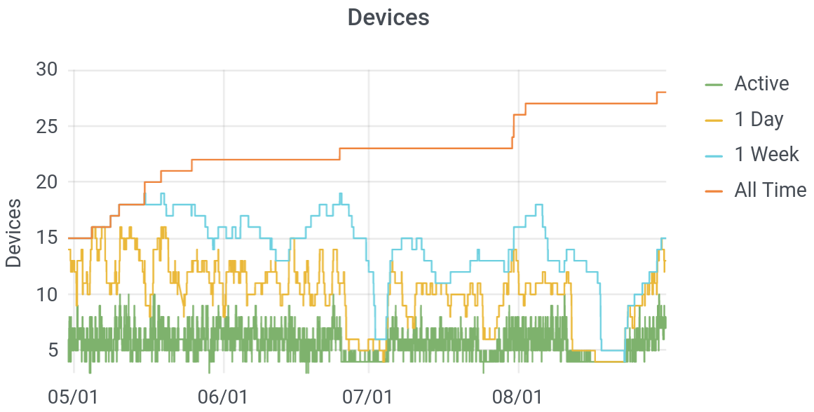
Let’s not judge here: these were covid-times, so adult visitors to our home were limited: my in-laws and my son’s buddy’s nanny. Still, it’s a little surprising that we have so many devices on the Internet – nearly 30 over the course of months, and around ten on any given day. Though devices are anonymous, you can infer from a plot like this when “someone” arrives in a home. My father-in-law, in particular, carries several devices: a watch, phone, and a tablet. Thus, his daily arrival to tend to my son is heralded by a jump in the number of active devices on our network. Further, you can see on a plot like this that we went on two vacations in July, and you can see the moment at the end of the month when my wife brought home a new phone.
Bonus: How Much Internet Do I Use or Need?
There’s a bonus feature on my own device, that I find fascinating: consumption. We did not include in our “study” devices, due to both the complexity of installation for users and concerns about privacy. Consumption measures how much data I used, minute by minute, over the last six months. It doesn’t show the sites I visited, but by making it possible for the devices to measure this, we would, technically have been able to see this. (My setup relies on different hardware: an extra “switch,” to redirect my internet traffic, for counting. You can read about the basic technical setup, here.)
At any rate, the public devices don’t have this feature, but mine does. What I find most-interesting about this, is to see how much Internet we actually really need. I wrote another post, addressing this question from several angles, but after recording this data for half a year I can color the story a little more.
The question is: what applications, devices, or services use enough Internet to actually run up against the limit of what I buy (60 Mbps)? Below are two plots of this, one from the better part of September, and the other zooming in to two days.
What do we see? Well, on a minute-by-minute level, we almost never use all of the bandwidth that we buy. It happens for about an hour, around September 10, when I set up a tablet with lots of videos for my son. However, that impression is somewhat misleading: Internet demand is very peaky. That is: I want my email now, not in a minute. On shorter time scales, the peaks in data rates are much higher higher (though of course, also shorter). Nevertheless, it is true that I am rarely wanting for speed. (Looking carefully, you can also see that the nights are generally pretty clear.)
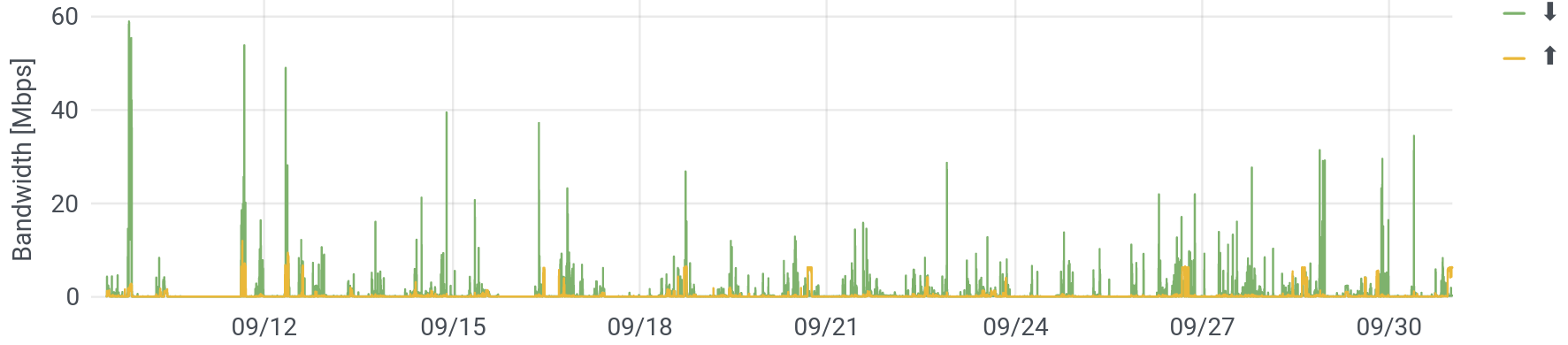
Let’s zoom in a little, to see periods of high demand. This used to be just video conferencing (hurrah, covid!) and occasional streaming. You can still see those “boxes” – sustained demand in both the up and downstream directions, as on September 29 around 7am or 2pm.
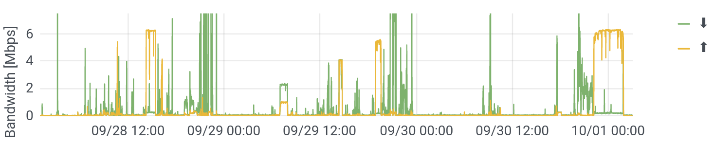
But what I didn’t see in my earlier data, were the super high and very-long upstream flows (maxing it out), as around 2pm on September 28 or midnight on Ocober 1. What are these? After some digging (again, not possible on public devices), this turns out to be my wife’s newer iPhone, which had some pretty weird backup settings going on. What’s notable about this is that, as already discussed, high bandwidth usage leads to poor responsiveness on real networks (buffer bloat). This means that at all those moments – which were both fairly frequent and fairly long – our Internet got sluggish. Granted, I’m only waiting a sixth of a second (150 ms) for a response, but that’s just for the first “resource” (say, a website). If that first resource (the website) references another resource (say, an image), that takes another sixth of a second. The whole experience can really slow down, and the performance of video conference applications, which rely on low and steady latency (low jitter), can really degrade.
Having a faster connection would let the phone complete its backup faster and that would make the network disruption shorter. Again, this seems to have come from weird settings paired with questionable implementation by Apple (an incremental backup should be fairly small, and these, clearly, are not). But with this absurdly detailed view of my home network, I was able to tweak the phone’s settings and make my network run a little better.